This week Robert Swift takes a look at how growth and value strategies have performed historically and how he sees them performing going forward.
There is no “right way” to invest. Many approaches can work and many styles or philosophies (growth, small cap, value, contrarian etc) all have their moment in the sun. Some strategies work better than others in that they are both less volatile (work more often) and offer more opportunities to the active manager in so far as they better identify high stock return dispersions = the survivors win big and the losers lose all.
The strategy which seems to work best and offer the most opportunity for active management is value.
This value bias however comes at a price. While value investors expect to have the last laugh they sure miss out on a lot of laughs in the meantime. Put another way there is ultimately a risk and return benefit to being careful about the price you pay for investments, and for wanting dividends, but you do miss out on bragging rights at the cocktail party in that you probably don’t own a ‘sexy stock’.
At the moment on a global basis, value is not in the sun but in the shade. We show the extent to which growth is currently more popular than value right now in the chart below. This traces the compound return of the S&P global growth index (blue) and the global value index (orange) in the last 10 years.
Growth is ahead by a handy amount and so one would prefer to use a growth approach right?
Probably wrong – you should never drive looking in the rear view mirror.
The logical conclusion actually, is that the value risk premium is now much higher than the growth risk premium. In other words, value stocks are more likely to outperform from here given relative valuations. The time series returns are starting point dependent so only going back 7 years would show value outperforming. It is this starting point dependency that illustrates the mean reversion of the styles.
Going back 20+ years growth wins quite handily with about a +1% pa excess return over value.
We try to show the benefits of having a value bias in the bar chart graph below which sorts stocks by P/E ratio and then their subsequent returns. It doesn’t look sensible to buy high P/E stocks and yet that is what growth stocks are now – on high P/Es.
Value investing is possible because capitalism allows companies to enter and leave businesses. New capital will flock to industries in which there are above average returns on capital and will leave those with below average returns. Growth stock industries attract new capital which drives down returns or causes enormous cash investment to remain ahead of the curve. In such cases there is little room for dividends which are a large part of the total return equation. Value stocks tend to be the opposite. Investors like to be with the crowd and so tend to ‘flock’ to growth stocks as they run up. It can all end in tears. The challenge is to remain immune from the fear of being unpopular and even looking stupid as the growth party rocks on.
More subtly some investors argue that it doesn’t matter whether growth or value wins. It is often beneficial to use both approaches with an active manager in each, since the return series are diversifying. As long as both styles avoid stock disasters, the combination of styles can be powerful. More on that in later articles.
The extent to which growth and momentum investing has gained an irrational upper hand can be seen in the following extract from a recent Bloomberg note.
“Investors may have borrowed money to chase the rally in the Sexy Six (Amazon, Apple, Facebook, Google, Microsoft and Netflix), resulting in a record amount of margin debt in March, Ned Davis, a strategist at the name-sake research firm, writes in a note. * Six stocks up 9.2% on a cap-weighted basis from March 1 to May 19, versus -1.8% for the rest of the S&P 500 * “The concentration in this bull market has been extraordinary, and that could be a sign of speculation and the type of narrow leadership seen in the late phases of bull market.” – Bloomberg
Value investing tends to come “at a price”. That is there are certain consequences of using such an approach and while the dividend yield is higher and the asset backing security greater, there are consequent sector exposures and periods of doubt or underperformance. We list the major characteristics of value styles below.
They tend to perform better in economic uptrends with rising interest rates. Are we there now?
Stocks usually more cyclical in nature. Other investors underestimate the earnings leverage and a change in fortunes can run for many years in a positive way.
Sectors favoured tend towards banks, insurance, telecoms, construction and utilities. These are not ‘sexy’ and the cocktail party chat is limited! It was actually the GFC and the subsequent years of enormous bank penalties and restrictions, that hurt a large part of the value index return. That period is likely to be over.
Attraction of low PE investing is that idiosyncratic risk or cross sectional vol of universe is greater. That is stock picking is more rewarded. (As written in Anna Karenina – All happy families are alike but all unhappy families are unhappy in their own way – who knew Tolstoy could be quoted with reference to value investing)
It is the reinvestment of the higher dividends that compounds up. Dividends are proof of cash flow.
Value tends to perform better in periods of higher M&A as it is the lower rated stocks in any given sector that tend to be acquired.
Tends to be characterised by higher dispersion of return – the stocks have more volatile beta, higher financial gearing and some of the value stocks never make it back since their businesses are fundamentally obsolete. These are known as value traps and the usual story is that of buying a horse drawn carriage in 1920 as they became cheaper and cheaper. There was no price at which it was right to invest – the industry was dead.Some would argue the car industry is dying now as we move to driverless cars. We will see.
To avoid value traps it is better to combine a low PE strategy with positive earnings revisions or some evidence of management and strategy change such as disposals or acquisitions and we do use this in our fund management research. Cheapness alone doesn’t do it. It is “Cheapness AND Change”.
Current low P/E stocks where we see change, and which we own are:
Valero – The world’s largest refining company benefitting from lower feedstock prices and the shale boom in the USA.
Glaxo Smith Kline – A UK based leading global drug company under new direction as it seeks to emphasise its consumer products division, and to get a better payback on its high R&D budget.
Cisco – A USA based company shifting from a dependency on hardware sales to a service and software business model.
Guy Carson takes a look at the three major players in the Australian insurance space. How do they work and is there value to found in QBE, IAG and Suncorp?
Australian Insurance: Is there quality and value?
Guy Carson
The Australian General Insurance landscape is dominated by three players: IAG, QBE and Suncorp. Over the last decade, investors in these companies have seen significantly different outcomes. In order to understand why, it’s important to look at how insurers make money and how they can insulate themselves from disasters.
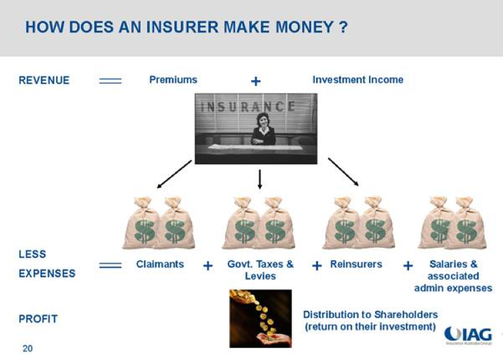
How does an insurer make money? The below graphic from IAG shows us the basic business model.
Source: IAG
Essentially, an insurer receives income from premiums and investments and in turn faces claims as well as various expenses. The difference between the two becomes the profit.
The confusing thing for investors is that whilst the business model is simple, the terminology used can be confusing. For example most insurance companies quote three different numbers when it comes to premiums:
Gross Written Premium (GWP) = the total amount received from customers for the payment of their insurance policies.
Gross Earned Premium (GEP) = When calculating results for the financial year only include the portion of policies up to June 30.
Net Earned Premium (NEP) = Gross earned premium minus reinsurance costs.
For earnings and valuation purposes it is the Net Earned Premium that matters although it is important to keep an eye on Gross Written Premium to see how the company is growing.
From Net Earned Premium we can then subtract the claims received as well expenses incurred in the course of business to arrive at the Underwriting Profit (or Loss). The first important step in choosing an insurance company is ensuring it makes an Underwriting profit.
Source: IAG
The great thing about owning an insurer though is that profits can be boosted by investment. The company holds a float of technical reserves (or policy holder’s funds) and can use these to generate further income. This is often referred to as an earnings multiplier.
Source: IAG
Furthermore the company can invest shareholders’ funds and gain further income that way.
Source: IAG
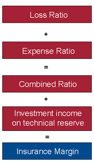
So that’s how the business model works. The question is how do we analyse whether an insurance company is performing well? For that there are a few simple ratios that help us understand how the underwriting business is performing. These are:
The Loss Ratio (or Claims ratio) which is the ratio of the net claims expense to Net Earned Premium; in simple terms the percentage of claims they received the premiums they earn.
The Expense Ratio which is the ratio of Underwriting expenses to Net Earned Premium; In simple terms the amount the company spends on its underlying expenses in order to run its business.
These two ratios together equal the Combined ratio. The combined ratio plus the investment returns earned give the Insurance Profit Margin. This margin describes the profitability of the business.
Source: IAG
So how do Australia’s general insurance companies stack up on these metrics? The table below is a summary of the most recent annual results from QBE, IAG and Suncorp.
Source: Company filings & Thomson Reuters
In the table we have separated the expense ratio into two parts for QBE and IAG – commissions and other expenses. This shows one of the critical differences between the QBE model and the other players. Companies with stronger brands tend to pay away less in commissions to sell their products. IAG in Australia and New Zealand has a number of well-known brands (think NRMA, CGU and more recently Coles Insurance). In their expansion overseas QBE took a strategy of rolling up smaller players, in doing so they have ended up with a significantly higher commission base and hence higher expense base. This additional cost pushes up their expense ratio and makes the company less profitable.
In the early days of the expansion, the company appeared to be doing well despite this higher expense base. Their Insurance Profit Margin rose strongly through to 2007 as can be seen below. The drivers included increased premiums, increased investment returns and a benign claim environment.
Source: Company filings & Thomson Reuters
IAG on the other hand had a different experience, after a difficult period from 2006 to 2008, the company has seen a strong recovery in their performance. The key reason the company struggled in that three year period was a rise in claims with the loss ratio rising above 70% as seen in the chart below.
Source: Company filings & Thomson Reuters
QBE saw claims rise significantly from 2008 to 2011 and the share price followed suit with a steady decline. One of the problems that QBE has is that its expense ratio is consistently higher than IAGs (due to the reasons discussed above). This means that its profit margin is more sensitive to changes in claims. In our opinion, the simplest way to define quality in Insurance companies is those with lower cost bases and lower expense ratios as they can withstand disasters more effectively. On this basis, we would say that IAG is the quality insurance name listed in Australia. Particularly given that after the difficult 2006-2008 period, the company came out with a renewed focus on costs and has reduced its expense ratio significantly since then.
Source: Company filings & Thomson Reuters
Of course, defining quality is only part of our investment process. We also have to take into account valuations as well. To this end, one challenge facing Insurance companies is the current low interest rate environment. Low interest rates mean the return on both the policy holders and shareholders’ funds are now lower than previous and hence the multiplier effect is no longer as strong. This suggests that insurance margins moving forward are unlikely to reach the highs of yesteryear. As a result it is also unlikely the shareholder returns of the past will be repeated.
Everything has its price though the question remains whether there is value right now. To that end we believe the market is currently pricing a solid recovery for QBE on the back of improving signs in its US business with the company trading on 13.1x forward earnings with expected growth this year of over 20% and further growth in FY18. The company can’t afford for anything to go wrong in this recovery. Meanwhile, IAG is priced fairly fully at 17.3x with earnings growth expected over the next few years of around 10% (after stripping out the impact of the Berkshire Hathaway quota share arrangement). Any increase in claims will likely weigh on the price. So in our opinion there appears to be no obvious value at the moment; however it is worth keeping an eye on the sector as share prices tend to overreact on events outside of the companies control such as weather related events. When share prices correct due to these events, they can quite often be solid longer term opportunities.
This week we bring to you yet another piece by friend of TAMIM Sam Ferraro of independent financial education firm Evidente. Given Guy Carson’s recent commentary surrounding housing and building approvals we thought it was an important read.
This article was originally penned on February 16, 2017.
Dwelling investment represents one of the highly cyclical components of aggregate demand. Since the inception of the National Accounts in the late 1950s, investment in housing has been subject to numerous cycles, but in the past dozen years the cycle has become more extended and less volatile (see chart below). At present, total dwelling construction accounts for 6% of GDP, a peak reached only five times in the past sixty years. Usually, housing activity of this scale has reflected overbuilding, and subsequently been followed by a sharp downturn, including: the 1980s, mid-1990s, early 2000s and mid-2000s.
NEW DWELLING INVESTMENT CLOSE TO A RECORD HIGH
What is particularly unique about the housing expansion since 2012 is the composition of dwelling investment. The GDP share of renovation activity – ‘alterations and additions’ – remains low by historical standards at around 2%. This was the basis for Evidente suggesting in prior posts that the renewed growth in house prices this time didn’t reflect an emerging property market culture, like that which prevailed in the early 2000s, when renovation activity lifted to 2.6% of GDP. Many home-owners became DIY experts over this period, and the turnover of the housing stock lifted as owner-occupiers sought to renovate and sell quickly at a handsome profit. Rather, new dwelling investment has underpinned the current expansion, which has lifted to 4% of GDP, its highest level since 2000/01 (see chart).
AUSTRALIA’S APARTMENT BOOM
The second dimension of Australia’s housing revolution has been a shift towards higher density living; Australia’s apartment and townhouse boom. The number of residential building approvals for higher density dwellings is now comparable to that for detached houses, at between 110k and 120k per annum (see chart).
In its February Statement of Monetary Policy, the RBA notes that within the higher density segment, there has been a shift towards apartment blocks with four or more storeys (see chart).
Australia’s housing revolution towards higher density living has been felt across the entire eastern border; the number of residential building approvals for apartment blocks and townhouses has posted strong growth since 2012/13 across NSW, Victoria and Queensland (see chart). In the past year however, there has been a substantial drop in high density approvals in Queensland and Victoria, probably reflecting the tightening of bank lending standards to housing investors and lower price growth. The RBA notes that the boom in apartment construction has been particularly concentrated in inner city Brisbane and Melbourne, which make these cities vulnerable to rising risks of over-supply emerging.
According to the RBA, the number of cumulative apartment building approvals in the three years to 2015 added around one third to the stock of apartments in both inner city Brisbane and Melbourne, but less than one-fifth in inner city Sydney. These divergent trends probably reflect the relative scarcity of available land for development in inner city Sydney.
WHY THE SHIFT TO HIGHER DENSITY HOUSING?
Higher population growth
A lift in population growth in the past decade has supported the dwelling investment cycle. Year on year growth in the population has remained above 1.4% for much of the past decade (see chart). This follows a fifteen year period in which population growth typically was below 1.2% pa.
Evolving consumer preferences towards more affordable living
Higher population growth can explain some of the shift towards higher density living thanks to land supply constraints, which have been associated with higher prices for blocks of land and detached houses. This has induced a shift in consumer tastes towards apartments, which use land more intensively and are therefore more affordable than detached houses.
Limits to the urban sprawlGiven the topography of Australia’s major cities, there are physical limits to further urban sprawl. Consequently, there has been an increase in the availability of former industrial or brownfield sites relative to urban fringe or greenfield sites, which are mostly used for detached housing.
Australia’s low urban population density slowly catching up to the rest of the world
Despite the shift towards higher density housing, Australia’s urban population density remains amongst the lowest in the world, which reflects postwar policies designed to encourage construction of detached housing on suburban land blocks – particularly for war veterans and their families – and the culture of aspiration for a house on a quarter acre block (see chart).
AUSTRALIA’S HOUSING REVOLUTION – HERE TO STAY
Evidente believes that developments that have led to the shift towards higher density living are likely to persist over the medium term: limits to further urban sprawl, shift in preferences to the convenience of living close to employment centres, Australia’s still low population density and the waning aspiration of owning a detached house on a quarter acre block.
Given the topography of cities such as Melbourne and Sydney, there are limits to which the urban fringe can further expand, not to mention the high transport infrastructure costs associated with developing greenfield sites that are more distant from the city. The aversion of Australia’s governments to lift debt levels or raise tax rates to fund infrastructure has seen a rush of sorts to sell or lease government assets. For instance, the Victorian government last year announced the long-term lease of the Port of Melbourne, with the proceeds linked to the replacement of around 50 railroad crossings across metropolitan Melbourne.
The growing demands of white collar occupations are such that many workers in these roles will want to continue to live close to employment centres, in addition to the convenience and diversity of choice associated with living in or close to the inner city.
Australia’s population density remains low by international standards. The scope for Australia’s capital cities to accommodate a growing population and increase population density probably depends in part on an easing of planning laws that allows higher apartment towers to be built across metropolitan areas.
The substitution effect from detached housing to townhouse and apartment living is expected to continue. Notwithstanding the risk of a correction in house prices, the average price of residential land and detached houses is likely to remain high, encouraging people – particularly young people – to live in more affordable, higher density housing than their parents were accustomed to. Against the backdrop of the shift that has already been occurring, the aspiration to own a detached house with a good size backyard on a quarter acre block is not ingrained in Australian culture as it once was.
INVESTMENT IMPLICATIONS – THE LONG VIEW…
Planning laws have promoted the development of apartment buildings and other high density dwellings along major roads and railway lines, that have easy access to public transport. But the demand on existing infrastructure is such that congestion has continued to increase. Traffic congestion remains a political hot potato for Australia’s federal government, as well as state governments, particularly in the two most populous states, NSW and Victoria. In addition to the removal of 50 railway crossings across metropolitan Melbourne cited, a number of other transport infrastructure projects are underway, including the construction of Melbourne’s metro tunnel and the widening of Transurban’s City Link.
Evidente believes that the two listed stocks most leveraged to the construction of infrastructure projects designed to ease traffic congestion are toll road operator, Transurban, and Downer, which generates over one-third of its revenues from its rail and transport services divisions. Downer has lifted its operating profitability in recent years to over 20%, continues to trade at a discount to the broader market, and has a sound balance sheet with a gearing ratio (which includes off balance sheet debt) of less than 15%.
Hardware retailers such as Bunnings might need to modify their product range over the medium term, with the growing army of apartment dwellers presumably having less need for garden appliances and power tools. Moreover, there is less scope for apartment dwellers to engage in DIY renovation than those living in detached houses.
…BUT DON’T FORGET THE CYCLE
Despite the prospect that the structural shift towards higher density housing will continue over the medium term, booms and busts around the new normal are inevitable. As cited above, new dwelling construction remains close to a record peak of 4% of GDP. The RBA has already warned about the growing risks of an apartment oversupply emerging in inner city Melbourne and Brisbane. By late 2016, half yearly growth in inner city apartment prices in Sydney, Melbourne and Brisbane had trended down to zero (see chart).
If conditions in these markets deteriorate substantially, banks would likely experience more material losses on their development lending than on their mortgages. Development lending is typically associated with a higher default probability and higher loss given default than on their mortgage lending for apartment purchases. Nonetheless, banks’ aggregate exposures to inner city apartment markets- particularly in Sydney – are greater through their mortgage lending than via development lending (see chart). The aggregate dollar value mortgage exposure translates to 2-5% of banks’ total outstanding mortgage lending to inner city Sydney, Melbourne and Brisbane.
Australian mortgage lending has historically been profitable due to low default rates – around 1/2 per cent – and high levels of collateralisation. Price growth of inner city apartments in Sydney has been strong in recent years, so that a large price fall would be necessary for banks to experience big losses due to lower loss given default assumptions. The buffers are smaller for Melbourne and Brisbane because capital appreciation in apartments has been subdued. The RBA estimates that combined inner city apartment values across Sydney, Melbourne and Brisbane would need to fall by 25% or more before banks started to incur significant losses.
In its quarterly update this week, the CBA showed its exposure to apartment developments by city, which amounts to a little over $5 billion in aggregate. Sydney apartments represent 60% of its exposure where the buffer is larger, while Melbourne and Brisbane in total account for a little under 30% (see chart). The total loan to value ratio of 60% is conservative and the CBA indicates that it has lowered its share of foreign pre-sales.
Although the P/B discount that banks trade on relative to industrials has narrowed in recent months, it remains high by historical standards (see left panel below). The sector’s ROE has dropped in part thanks to de-gearing associated with a lift in loss absorbing capital buffers, but the ROE prospects for the industrials universe have deteriorated by more (see right panel).
Evidente is an independent financial consulting firm managed by Sam Ferraro that delivers innovative financial advice to wholesale investors, including active long only funds, hedge funds, pension funds, and sovereign wealth funds, in Australia and globally. Drawing on academic research in asset pricing, behavioural finance and portfolio construction, Evidente provides wholesale investors with commercial solutions to stock selection and asset allocation decisions across equities and other asset classes.
Sam writes as a freelance journalist for The Age, Sydney Morning Herald and Australian Financial Review, was a member of the advisory board of API Capital, teaches business finance and international finance courses to undergraduates at RMIT, and most importantly Sam is a well respected source of information and friend of TAMIM.
Scott Maddock, portfolio manager for the TAMIM Australian Equity Income IMA, takes a look at the trade-off one must account for when aiming to generate income from an equity portfolio. He takes a look at two stocks held to deal with exactly that.
Income vs. Capital return – managing the trade-off in an income portfolio Scott Maddock CBG Asset Management
Source: CBG Asset Management
We can deliver income in a portfolio both by crystallising capital gains (selling securities at a profit) and by investing in high yielding securities. When building an income portfolio, we aim to balance investing in higher yielding securities against those with the possibility of growth in value. Few strongly growing companies pay a high dividend – preferring to reinvest capital back in to the business. This grows value but doesn’t pay cash to shareholders. The obvious step for an income portfolio is to focus on high yielding but lower growth companies. However, this ultimately results in low total returns to investors as;
Those companies often underperform the overall (growing) market.
Risk is higher due to excessive concentration in similar sectors / businesses.
Interest rate sensitivity is higher – demonstrated last year when the market withdrew the favoured status of property, utilities and infrastructure.
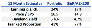
Our approach therefore has been to build a portfolio which has a yield higher than that of the broad market but also holds shares in companies capable of growing returns or asset values.
This provides the potential for a higher total return while ensuring the income stream generally exceeds that available from cash and interest rate securities. The trade-off means we hold some stocks with high yields, some with low yields but good earnings growth and some which fit in the middle of both ranges.
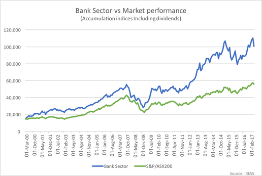
A fine example of this trade-off is the Bank sector. Banks have long been a no-brainer for investors looking for tax effective income (fully-franked) and capital growth Historically, high returns on capital, strong credit growth in the economy and the ability to restrict cost growth to a lower rate than revenue growth supported the sectors total return. Even with a step down in credit growth post the GFC, the banks have outperformed. Credit growth remained solid, reduced competition supported net interest margins and lower credit growth allowed the banks to increase dividend payout ratios. However, capital requirements have now risen, reducing the sustainable payout ratio for a given level of growth. Dividend payout ratios look stretched for NAB and Westpac suggesting little dividend increase is likely. We expect further slowing in housing credit growth and, combined with factors such as the bank levy, the result will be slower earnings and dividend growth. The sector has therefore become less attractive.
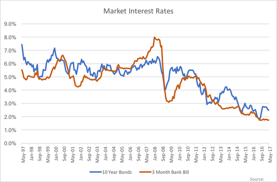
This is the end (?) of a trend which has been dominant in the Australian investment market since the early 1990’s. The implications are that we need to look further afield, to build a portfolio of investments intended to deliver a solid total return while also paying a level of income. Clearly current interest rate levels are not sufficient to deliver a meaningful income from cash, term deposits or longer term bonds. Bond rates are below 3% while shorter term rates are below 2%.
Two stocks we currently include in the portfolio which offer a bit of both income and capital growth potential are Charter Hall Group (CHC.ASX) and Regis Healthcare Limited (REG.ASX);
Charter Hall is a property funds management business with a successful track record of fund expansion and performance delivery. CHC shares are currently trading on a 12mth dividend yield of 5.2% (unfranked) while delivering strong earnings growth as commercial property values remain strong and demand for professional management of property portfolios drives increased funds under management. CHC also co-invests in the funds and so has a focus on increasing asset values as well as maintaining income levels.
Regis Healthcare is a high-quality operator of Aged Care facilities. Share prices in the sector have been depressed by changes to government funding formulae however REG has been less affected by these changes than the market expected. REG shares are currently trading on a 12mth dividend yield of 4.8% (100% franked) while maintaining a strong outlook for earnings growth in coming years.
This week Guy Carson, manager of the TAMIM Australian Equity All Cap Value IMA, takes a look at the Bank levy announced in Budget 2017. Will the cost be passed on?
Will the bank levy be passed on? Guy Carson
Four weeks ago we wrote an article entitled Australian Banks: The death of a 25 year bull market, in which we looked at recent history and suggested that the tailwinds of lower interest rates and favourable regulation were over for the Big four banks. With regards to regulation, we focused on recent changes from APRA and the indication from that organisation that further measures were to come. What we didn’t expect at the time was action from the Federal government and to that regard we were surprised by the introduction of a bank levy in the 2017 Budget last week.
It is fair to say the banks were caught off guard as well by this move as well. In response the CEO’s of the big four have issued statements suggesting that the cost will be felt by “shareholders or customers” or perhaps a combination of both. The government hopes that the banks will not pass the increase on to customers, with Scott Morrison saying “The banks want to send a message to their customers about how much they value them? Don’t do what they may be contemplating doing [raising rates or reducing returns]. Don’t do it.” Therefore, the suggestion from the government is that shareholders wear the cost.
In order to determine who will feel the bank levy, it’s important to step back and to look at two things:
What is the bank levy? How does it work?
How might the banks react to this new charge?
What is the bank levy?
In order to understand how the bank levy works, it’s important to understand how banks are funded. The big four currently have leverage ratios of approximately 5% (ANZ 5.3%, CBA 4.9%, NAB 5.5%, WBC 5.3%), this effectively means they have leveraged their equity 20x and the remaining 95% of the balance sheet is funded by liabilities. It is these liabilities that the bank levy is set to target.
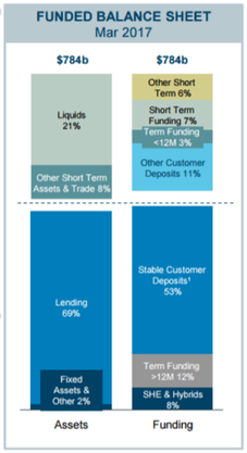
The levy applies to all bank funding outside of shareholders equity (including retained earnings) and deposits less than $250k. The below chart breaks down ANZ’s current balance sheet by both assets and funding source, it is the funding side that we need to focus on.
Source: ANZ company filings
Roughly speaking, the Big 4 have balance sheets that are 10% funded by Shareholders Equity (SHE) and Hybrids, 60% funded by customer deposits and 30% by wholesale funding. The wholesale funding above is split into short term and term funding. These buckets are a product of capital markets and include instruments such as corporate bonds and commercial paper. These bonds are typically held by offshore institutions.
The levy is 6bp and is charged on the liabilities as identified above. To break it down further:
The wholesale funding on the balance sheets of the big four will be subject to the levy, it’s impossible to avoid. So at a minimum 30% of their balance sheet will be subject to it.
The equity component which ranges from 4.9% for CBA to 5.5% for NAB will not be subject to the levy. Note that the 8% number in the diagram from ANZ above includes hybrids which are subject to it. This potentially means less hybrid issuance going forward.
The grey area is where the bulk of the funding comes from and that is deposits. A majority of the current deposit base is over $250k and is subject to the levy. How the banks react to this is potentially the key to who bares the cost of the levy.
How will the banks react?
The banks were caught off guard by the announcement of the levy and as a result we are yet to see any reaction outside of a few statements warning of the consequences. Therefore we’re not yet sure on what will happen but we can look at some hypothetical scenarios. The banks have indicated that the costs of the levy will be felt by “shareholders or customers”, we’d also add in a third category: staff.
Essentially we can see three ways the Australian banks may react:
Take the hit and see Net Interest Margins (NIM) reduce. Meanwhile try to offset the NIM impact by reducing staff numbers, improving productivity and lowering the cost to income ratio.
Since deposits under $250k are now more attractive on a relative basis, the big four could increase Term Deposit rates for lower amounts and try to lock in funding that way.
Increase interest rates for borrowers, most likely mortgage holders as that the bulk of their asset book.
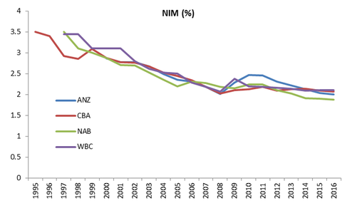
We’ll start by looking at scenario one. The banks NIMs have been declining for over 20 years from levels of around 3.5% to 2.0% today.
Source: Thomson Reuters & company filings
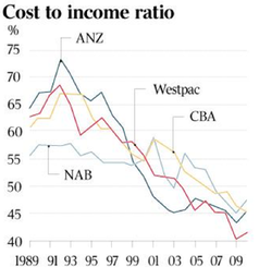
The offsetting factor though has been their productivity. Technology and scale has brought down the cost to income ratio for banks by allowing them to work more efficiently with less staff concentration. The below chart shows this with cost to income ratios dropping from above 60% in the early 1990s to around 40% today.
Source: The Australian, CSLA
So if the banks were to except the 6bp charge on their NIM, they may look to reduce staff numbers and costs further. This is a path the banks are currently undertaking and ANZ CEO Shayne Elliot was very open at the recent result that in a low credit growth environment, the only way to grow profit is to shrink your expense base. ANZ has stripped out $150m of staff costs over the last 12 months and plans to cut it further over the next two years.Ultimately, the banks won’t be able to fully offset the NIM impact through cost control but it will help.
Moving onto scenario two. In August last year, after the RBA cut interest rates we saw something unusual. The big banks all moved to increase term deposit rates. This lasted for about a month and was essentially a market share grab from the big four against the smaller players. Given the now relative attractiveness of smaller deposits, we may see something similar in the coming weeks. The flow on effect will be that players such as Bendigo Bank and Bank of Queensland will be forced to increase their rates to compete. Therefore funding costs across the industry will rise. Although it must be noted that the regionals will still have an advantage over the big four, as it is impossible for the big four banks to reprice their entire funding book. It is only the marginal flow that will be repriced which is a small aspect.
Rising funding costs brings us to scenario three and the pass through. If the big banks do successfully push marginal funding costs up across the industry, then mortgage rates will rise. This follows a recent trend of “out of cycle” rate rises. The interesting thing is that it is questionable, given high household debt, whether the economy can withstand increasing interest rates. As a consequence if rates do continue to rise, it raises the probability of further RBA cuts later this year.
Now these three scenarios are not mutually exclusive. Ultimately we’d expect all three to happen to some degree. Banks have been cutting costs for some time in the face of slower revenue growth, it can be expected this will continue. We expect there will some sort of market share grab with respect to Term Deposits in the not too distant future and in conjunction with that we might see a rise in interest rates for mortgage holders right across the industry. The combination of all three may still not be enough to absorb the levy and hence the prices of the Australian banks have fallen since its announcement.
So where does this leave us with respect to our view on the banks? In our recent piece, we noted that banks faced a risk of greater regulation and whilst we did not expect this levy, it is part of a greater trend. This levy therefore further reinforces our view that the best days in terms of share price performance are behind them.
Finally, we do note that the recent history of the Australian government is not great with regards to market timing. In 2012, the then Labour government signalled the end of the mining boom when they introduced the mining tax. Has this Liberal government’s 2017 Budget managed to do the same with the banking boom?


 Source: CBG Asset Management