Everyone has been obsessed with the FAANGs, FAAMGs or “Sexy Six” for a while now but Robert Swift, manager of the Global High Conviction strategy here at TAMIM, only holds one. Robert takes a look a one of his better performing stocks of late to help explain why this is while examining the fallacy that stocks can be defined by a singular sector.
We often show investors our sector and region weights. These are important aspects of our portfolio construction process because ensuring a wide spread of sector and country exposure is a sensible way to diversify and control exposure to a detrimental event in any one country or sector. The sector definitions make intuitive sense, as do the regions or countries into which the companies are placed, but companies are often classified as one type of company when they are really another. Understanding what drives a company’s profitability, and where the risks lie, is important and to that extent it is important to not just passively accept the classifications given to you by convention.
This is why a sophisticated risk model is critical since many companies classified as one type of business actually contain elements of others. Put together in a portfolio these elements can combine to produce large unintended and undesirable characteristics. Portfolio management is more than picking stocks one by one – you have to know where the aggregated risks are and how big and how to measure them.
A current example of a technology stock which perhaps isn’t, would perhaps be Apple, which is increasingly a consumer goods company? Most of its manufacturing is outsourced although it designs the items and operating system; it relies heavily on constant fashion cycles to drive revenues; and it sells directly to the consumer from its own branded stores. If it were a French luxury goods company such as LVMH or Hermes, would it be treated and rated differently by the stock market? Quite probably. Similarly, Google, while definitely still a tech stock, could also be considered one of the world’s premier advertising companies.
A technological advantage is worthwhile because it protects margins and the business franchise. One of our investment themes is that technology is increasingly to be found everywhere and as a key source of competitive advantage, is not just in semiconductors or circuits, but also in supply chain logistics, or heavy equipment manufacturing, and resource exploration and extraction. As technology enters more industries we ask why do tech stocks (hardware and software), command a premium P/E multiple?
Technology can fail and be subject to intense competition and regulation. Furthermore the capital investment required by technology companies to stay ahead, can be enormous and single failed product cycles disastrous. Nokia used to be THE dominant mobile handset company but missed a couple of product cycles and is now an ‘also ran’. Before then came Sony which really should have invented the iPod or generic digital portable player, since it had been first with The Walkman. For whatever reason it became side tracked and missed the shift to digital. The list goes on. Companies with such requirements to keep spending exposure should arguably trade at a P/E discount to reflect this risk?
Consequently if you can invest in technology without the high P/E then why wouldn’t you? Such opportunities exist and they exist outside the sector classified as “technology”. Our favourite example would perhaps be Gilead, the bio technology company. This is now our largest holding after a decent rally in the last few months.
Following the Kite acquisition we have looked at what the acquired cancer technology does and it is pretty astounding. Just as clever as placing binary code on a graphics chip and sound card to make a mobile phone – or at least we think so.
Kite, now owned by Gilead, specialises in oncology or cancer treatments. They have produced a new way to fight certain types of aggressive cancers by reprogramming the body’s own auto immune system. CAR-T or Chimeric Antigen Receptors are programmed onto T cells which are taken from the blood of the patient. T cells do the fighting against foreign cells for the body. These receptors are programmed to fight the specific cancer and are consequently a much less traumatic process then radiation, surgery, or chemotherapy which are the other options.
The best analogy we can think of is the training of special police forces to drop into a crowd riot and identify and take away the key agitators. Up until now, the only option has been to isolate and contain the whole crowd and be prepared to arrest everybody and anybody.
Adding to the complexity is the fact that the blood has to be reprogrammed in a laboratory and then taken back to the patient. This has to be done quickly since these cancers are often aggressive. Think of this as supermarkets running logistics to get fresh food from the farm to your table in a few hours or days. And yet supermarket multiples are higher than GILD which trades on a P/E of less than 12x.
CAR-T is applicable in other areas than oncology so Gilead have potentially bought a complete drug delivery system. Currently it is dealing with blood and potentially lymphoma cancers, but tumours in pancreas or liver or auto immune diseases like type 1 diabetes or lupus are potentially treatable and curable with this CAR-T approach.
For all those ESG investors out there it also does some real good since it actually cures people, it isn’t just a treatment. Hence the shrinking market for some of Gilead’s original drugs which cured Hepatitis C.
For certain there are risks, as with any investment. Gilead needs to grow its other drug treatments offshore and incidentally has just won approval in China for its Hepatitis C drug. Additionally, Gilead and Kite won’t be the only pharmaceutical company developing this treatment, and Novartis, a Swiss based company, is already out there with an approved product, but it trades on a multiple of 30x. There will also be an issue with the cost of CAR-T, since treatment is expected to be c.$500k for a one time attempt.
However, we think that buying cutting edge technology on a P/E of 11x is a pretty good price and notwithstanding the challenges with its existing drug pipeline, as well as obtaining US government approval for this therapy, GILD looks to be up with Novartis and ahead of the crowd, and as worthy as Facebook, Apple, and Amazon as being considered a technology leader: at a fraction of the valuation.
Adrian Lemme, analyst with the TAMIM Australian Equity Income portfolio, takes a look at the impending arrival of Amazon and the impact it should have on the Aussie landscape.
Amazon Not Introducing Internet to Australia TAMIM Australian Equity Income – Merlon Capital Partners
Every day it seems the media is reporting how Amazon will destroy Australian retailers. We are under no illusion that Amazon will take market share and reduce the profitability of Australian retailers. It would be foolish to think otherwise given that Amazon grew its North American sales by 25% to US$80b during 2016 and this remarkable growth shows no signs of abating. However, after reviewing key differences between Australia and other markets, we believe the impact of Amazon is being overplayed and continue to see excellent value in the retail sector.
Online retail is maturing
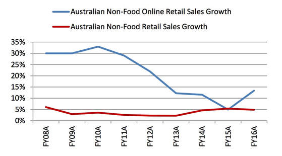
The growth of online retailing in Australia has slowed from around 30% pa up until FY11 to an estimated 13% in FY16 (chart below). In recent months this growth has fallen further to 7-8%. We believe the lower growth in recent years has partly been a function of the lower Australian dollar which has reduced the price incentive to purchase from international online retailers. Nevertheless, we expect Amazon’s expansion and the associated media coverage will see online sales growth accelerate.
Growth in Online Retail Sales (Non-Food) vs Retail Sales (Non-Food)
Source: ABS, NAB, Merlon
Amazon’s Australian entry
It must be recognised that Amazon already has a market presence in Australia through the amazon.com.au site (Kindle) as well as export sales. While not disclosed, market estimates put Amazon’s sales in Australia at between $500 and $700 million. This obviously provides a good launching pad but also means at least initially that sales in Australia will somewhat cannibalise their current sales.
Amazon’s decision to expand in Australia at this time is closely linked to the upcoming introduction of GST for low value imports. Former Amazon executives have told us that until now Australia was considered to have been well serviced by Amazon’s other sites. With the change to the GST threshold, Amazon has lost an important competitive advantage and has therefore taken the view that it needs to establish a local presence to defend and grow its sales here.
Amazon is likely to start with Fulfilment Centres in Brisbane, Sydney and Melbourne. Amazon Prime (as discussed later) will likely commence within two years of entry as per the Mexico experience. Amazon ‘Prime’ memberships will be aggressively marketed following launch by heavily discounting the first year’s annual fee as was done in Italy.
Amazon’s competitive advantage and impact on industry structure
In assessing the impact of Amazon on the Australian retail sector, we draw on our investment process which places significant emphasis on industry structure and competitive advantage. We believe that high returns on capital and hence free cash generation can only be sustained through a combination of favourable industry structure and strong competitive positioning. Through our qualitative scorecard, we explicitly consider Amazon’s impact on industry structure and the competitive advantages enjoyed by the listed retailers.
Amazon will impact the industry structure of Australian retailing by reducing barriers to entry for niche retailers through its third party marketplace. The bargaining power of customers will also increase with increasing price transparency and product choice. On the other hand, it is reasonable to expect further industry consolidation as existing online operators become marginalised and weaker physical retailers exit.
Amazon also clearly possesses competitive advantage across cost, product differentiation and service.
Amazon has a cost advantage by avoiding retail rents and store labour, both of which are high in Australia by global standards. Through its wide range and Amazon Prime, Amazon can fractionalise delivery costs relative to mono-line retailers.
Importantly, we do not believe Amazon will have a sustainable advantage sourcing branded products cheaper than large domestic retailers. Global suppliers will have no choice but to offer equivalent prices to local retailers and domestic warranties will remain important.
With regards to product differentiation, no retailer in the world can match Amazon’s range. Amazon operates in virtually all retail categories including fresh food and its US site is estimated to have approximately 500 million products for sale. It is able to achieve this principally through the use of its third party Marketplace that greatly enhances the range beyond what Amazon could stock alone.
Amazon’s ability to develop intimate relationships with its customers through bundling its offers and convenient fulfilment is perhaps its greatest source of competitive advantage. Through Amazon Prime, US customers qualify for free two day shipping on orders of at least $25 for an annual fee of $99. Amazon is estimated to have 60 million US households signed up to Amazon Prime and is rolling out similar services in other markets. This service is made even more attractive by the bundling of the Prime Video streaming service. Additionally, the Amazon Prime Now service enables free two hour delivery on a range of over 25,000 items. Same day delivery will threaten traditional retail profit pools generated from categories such as high margin accessories.
Retailers with large store footprints will need to compete on in-store experience and service, while utilising store networks for instore ordering and shipping to store for ‘click and collect’.
There is no doubt that the entry of Amazon will diminish the attractiveness of the retail industry structure in Australia and place pressure on incumbent retailers to cut costs, improve their propositions and strengthen their relationships with customers.
Contrasting the overseas experience with Australia
Amazon has been in the US, UK and Canadian markets for well over a decade. We have therefore studied these markets to gain a better understanding of Amazon’s likely impact in Australia.
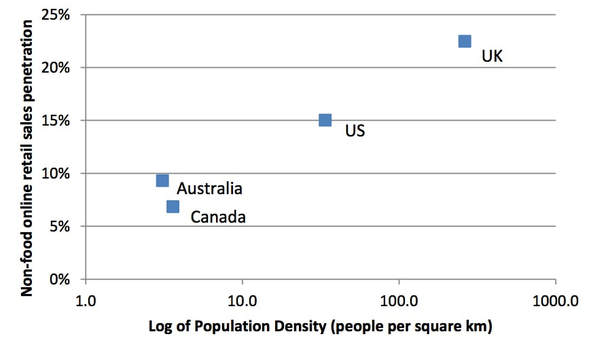
A key observation when comparing these four countries is that the success of not only Amazon, but online retailing in general, is significantly linked to population density:
Non-food online retailer sales penetration vs population density
Source: ABS, NAB, US Census Bureau, UK Office for National Statistics, Statistics Canada, Merlon
As shown by the chart, non-food online retail sales penetration is highest in the UK, which also has the greatest population density. Correspondingly, penetration is lowest in Canada and Australia where density is lowest. Importantly, Canada’s official data excludes international online sales. Given Canada’s close proximity to the US, it is reasonable to assume that Canada’s penetration including international online purchases is in line or slightly above Australia.
This relationship is perfectly logical given that the more dense an area is, the faster and more cost effective it is to fulfil an online order (since there will be many other orders in the same area).
Sceptics will say that Australia is actually very dense on the east coast. But this is no different to Canada which has similar levels of density in its main cities along the southern border to the US.
Linking this back to Amazon, it has clearly struggled in Canada. Amazon entered Canada in 2002, later launching Consumer Electronics in 2008 and remaining categories in 2010. While Amazon does not disclose its Canadian retail sales, we can infer from its segment accounts that it is doing at most US$2b of sales (excluding third parties) out of a total Canadian retail market of US$320b. This pales in comparison to Amazon’s US retail sales of approximately US$78b. Even adjusting for lower population, Amazon has not been nearly as successful in Canada as it has been in the US and has admitted as such.
US sales tax arbitrage helped in the early years
Sales tax is an important feature of Amazon’s US experience that will not be replicated in Australia. For many years, Amazon enjoyed an enormous free kick because it was not required to collect state and local sales taxes in states where it did not have a physical presence (for example, a fulfilment centre). For example, in 2011 it only levied these taxes on sales from five states. This gave it a distinct price advantage over its store based competitors where state and local government taxes can quickly add 7-10%. Today, Amazon collects sales tax in all 45 states with a sales tax regime but this was mostly addressed only this year. At this point it’s a non-issue in the US given the scale and customer acceptance that Amazon has already achieved. Clearly though, Amazon’s growth in Australia will not benefit from the same circumstances since it will be required to collect the 10% GST from day one.
Convenience of delivery will be another challenge for Amazon. Missed deliveries will either incur a costly redelivery or force the customer to collect from the Post Office, Courier Depot or other pick-up point. This is a much poorer customer experience than very dense US cities like New York, where some customers can simply collect their delivery from their doorman as they return home.
Impact on retail sector stocks
Given Australia’s similarities to Canada and differences to the US, we expect it will take longer than many expect for Amazon to have a meaningful impact on the Australian market. Nevertheless, Australian retailers will lose share and endure margin pressure as Amazon expands, but the extent will vary by category and competitive position of individual retailers.
Established pure play online retailers will be among those first impacted. Clearly, eBay will be challenged since it is most comparable to Amazon domestically (particularly with respect to Amazon’s Marketplace). In the US, Amazon dwarfs eBay and we therefore expect Amazon will eventually overtake eBay here.
In terms of individual retail categories, Amazon’s success will be linked to the extent of service and importance, or lack thereof, of in-store experience. Amazon does best in categories that have products with low service requirements and that are easy to ship in a box. While there is very little sales mix data available for Amazon, it is true to say that its market shares are highest in Media, Electrical, Sports and general merchandise. On the flip side, it has very low share in large whitegoods (approximately 1% in the US), furniture, Auto and grocery.
From this perspective, we also see Department stores as being significantly impacted by Amazon’s entry. In the US, this category has been contracting for the last 10 years with store closures now accelerating. Of particular note is Kmart, which has very high margins and very low prices. Ironically, these low prices make the shipping cost far more significant and will be at high risk once Amazon Prime launches with free one or two day delivery.
In-store experience needs to improve and costs need to come down
One of Amazon CEO Jeff Bezos’s famous quotes is “Your margin is my opportunity”.
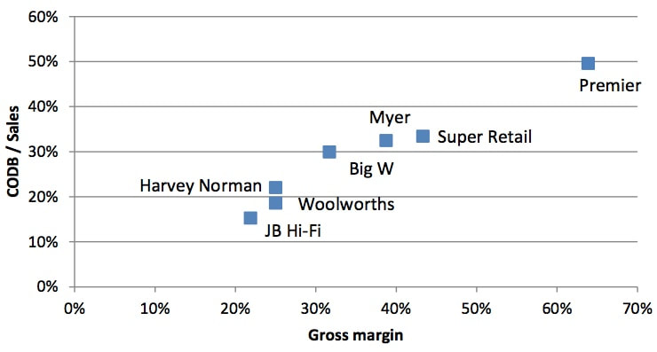
On a stock level, we consider the retailers at most risk from Amazon are those that exhibit both high levels of gross margin selling commodity products and high costs of doing business (CODB). Retailers with these characteristics may very well find their lunch cut by Amazon through its low price strategy and low operating costs. Given this, we have plotted a subset of Australian retail stocks using these two metrics:
Australian retailer gross margins and CODB / Sales
Source: Company Reports, Merlon
JB H-Fi is well positioned to compete with Amazon given it has both a very low gross margin and low operating costs (which is partly a function of its very high sales per square metre). On the other hand, retailers such as Super Retail, Myer and Big W face more challenges because both their gross margins and cost bases are substantially higher than Amazon’s (which we estimate has a retail gross margin of 22-25% and a retail CODB / sales of approximately 15-20% of sales). While Premier stands out as most exposed on these metrics, it sells its own products not available elsewhere. Furthermore, its Smiggle and Peter Alexander brands are particularly differentiated in the marketplace.
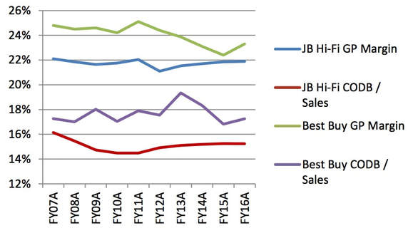
We have also compared JB Hi-Fi and Harvey Norman to offshore electrical market retailers Best Buy (US) and Dixons Carphone (UK). From this, we expect that JB Hi-Fi and Harvey Norman can each hold sales and earn reasonable margins after a period of adjustment given the experience of both Best Buy and Dixons Carphone. For example, Best Buy took a hit to profitability in 2013 but started with a higher gross margin and CODB / Sales than JB Hi-Fi has currently, meaning that JB Hi-Fi is comparatively better positioned (below). In any case, Best Buy’s margin has since largely recovered.
JB Hi-Fi EBITDA Margin Composition vs Best Buy
Source: Company Reports, Merlon
Underscoring JB Hi-Fi’s low gross margin, our sampling of prices by electrical category suggests that the differential in pricing on Amazon’s US website to JB Hi-Fi (when adjusting for GST and currency) is minimal aside from a few categories such as Accessories, Headphones and AV receivers. In the case of the latter two categories, we believe this is mostly a function of suppliers charging more here because they can but we expect these suppliers will be forced to adjust their pricing to better reflect US prices.
From a category perspective, while Amazon is the number two player in US electronics, JB Hi-Fi’s recent acquisition of The Good Guys and Harvey Norman’s exposure to whitegoods and furniture (approximately 40% of sales) should offer some insulation given Amazon’s miniscule (1%) US Appliances (Kitchen/Laundry) share. We also expect both JB Hi-Fi and Harvey Norman to benefit from further consolidation, with Department stores most likely to exit this category as well as smaller, sub scale electrical players. In any case, Harvey Norman’s international businesses and conservatively valued commercial property portfolio will also act to buffer any impact from Amazon on its Australian franchise operations.
With regard to Supermarkets, Amazon’s recent acquisition of Whole Foods in the US is evidence that Amazon Fresh will be a premium rather than price-led proposition. This supports our view that bricks and mortar is critical to any omni-channel strategy and plays into the strengths of Woolworths and Coles. Amazon has been dabbling in physical retailing since 2015 although to date focused on bookstores and showcasing its own gadgets.
Finally, we believe that retail Real Estate Investment Trusts (REITs) will need to reduce rents over time to enable retailers to better compete with Amazon. Clearly, a specialty retailer with rental expense representing 25% or more of sales will struggle to be able to match the pricing of Amazon whose total costs to sales is below that. While the market has started to price this into retail REITs such as Scentre Group, we believe it is still not fully priced in.
A lot is already factored in
Our investment philosophy is built around the notion that companies undervalued on the basis of sustainable free cash flow and franking will outperform over time. That said we also believe that markets are mostly efficient and that cheap stocks are always cheap for a reason. It follows that we are focused on understanding why cheap stocks are cheap. To be a good investment, market concerns need to be already priced into the current share price or deemed invalid. We incorporate these aspects with a “conviction score” that feeds into our portfolio construction framework.
As discussed above, our qualitative scorecard provides a vantage point from which to consider Amazon’s impact on the retail industry structure and the competitive advantages enjoyed by incumbent players. This qualitative assessment weighs into our projected growth rates and sustainable cash flow estimates for the retail stocks that we cover. For JB Hi-Fi and Harvey Norman we have modestly trimmed our estimates of sustainable free cash flow in recent months on the basis that their growth and margins will be impacted by Amazon but on balance think that they will still remain strong, viable businesses.
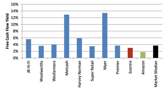
It follows that we believe the market has become overly pessimistic. Since 4 November 2016 when Amazon’s expansion was first speculated in the press to 30 June 2017, discretionary retailers such as JB Hi-Fi, Harvey Norman, Super Retail and Myer have underperformed the ASX200 by between 23% and 36% resulting in relatively high free cash flow yields (Figure 9). The supermarket stocks have understandably held up better given their strong grocery businesses and Wesfarmers’ diversification in Hardware and Coal etc.
Last reported free cash flow yields
Source: Company reports, Merlon
Rather than the entry of Amazon, we view elevated housing prices and highly indebted consumers as the most significant issues facing the listed retailers. As we have discussed previously, we think house prices are modestly overvalued but not to the extent many commentators suggest. Further, household savings rates are historically high and balance sheets historically strong which somewhat tempers our concerns.
Note: The portfolio underlying the TAMIM Australian Equity Income IMA retains positions in Harvey Norman, JB Hi-Fi, Wesfarmers, Woolworths and Metcash but has no exposure to retail REITs, Super Retail or Myer at the time of publication.
Guy Carson takes a look at the series of booms that have been propping up the Australian economy over the last decade and where we might be headed from here.
Australia has just celebrated 26 years without a recession and the Government as well as the Reserve Bank of Australia (RBA) are cheering the ongoing growth. In fact, the common consensus amongst these authorities is that growth is set to rebound from its current 1.9% year on year rate and wages are set to rise as well. There were some encouraging signs in the latest GDP release, most notably the increase in public fixed asset spending (infrastructure), however when we step and take a longer term view things aren’t so rosy.
GDP growth over the last decade has averaged 2.5% per annum; this is the weakest ten year average since the 1990 recession. On a per capita basis the story gets worse, Real GDP per capita has averaged just 0.9% over the last 10 years, the weakest since Malcolm Fraser was Prime Minister. In other words, outside of an increased population through record immigration, the Australian economy is barely growing. As a result of this weak growth, wages have stalled and households are becoming vulnerable. It becomes increasingly clear to us that Australia has joined the rest of the developed world in “Secular Stagnation”.
“Secular Stagnation” is a term originally used by Alvin Hansen back in 1938 and more recently popularised by noted economist Larry Summers. The theory is that four major factors are weighing on growth, inflation and hence interest rates. These factors are deleveraging, demographics, wealth transfer and technological advance. Whilst Australia is currently fighting the demographic trend through record immigration, it is the prospect of deleveraging that has most observers worried.
Deleveraging is the consequence of high debt levels globally at the household, corporate and government level. Debt has risen steadily since the 1980s as interest rates have fallen. If we look back to the start of that period, it marked an important transition. The manufacturing base of the world started to shift from West to East and the rise of the Chinese economy started. As a response to slowing economic growth Central Banks in the developed world began to cut interest rates. Over the period since, every time the global economy appeared to stall, interest rates were cut by 4-5% in order to stimulate growth and never fully recovered to their previous peak. The developed world shifted to a consumer driven services economy.
Source: Thomson Reuters
By definition, the ability of consumers to purchase goods and services is equal to their income plus the net amount of debt they take on (or pay off). As interest rates decreased, households took on more debt and boosted the economy. The problem with this model is twofold, for increasing economic growth rates the amount of debt taken on in the next period has to be more than the previous period and secondly households (unlike governments) have a limit to how much they can borrow. Most of the developed world discovered that limit in 2008 whilst Australian households have continued to lever up, albeit it at a slower rate recently. The problem the RBA has now is the closer you get to zero, the less impact interest rate cuts are likely to have. In addition they have been quite vocal around the record levels of household debt, indicating they are unlikely to cut interest rates further.
It is quite extraordinary that the Australian economy has managed to avoid a recession in the wake of the mining boom. One of the key drivers has been the residential property market and in particular the construction boom. This boom started was spurred on by the RBA cutting interest rates from 4.75% to 1.5%. By cutting interest rates, they boosted property prices and that flowed through to construction. Whilst people tend to focus on those property prices in Melbourne and Sydney, for GDP and Employment it’s the volume of construction that matters. Leading indicators of residential construction started to point down late last year (particularly in Brisbane) and this driver of growth is likely to subside. Currently it appears the slowdown will be gradual but it is important to keep an eye on the key indicators to see if the decline does accelerate. Additionally whilst the national slowdown may be gradual, there will be pockets that experience a hard landing.
This period for Australia is very similar to early 2000s in the US where the Federal Reserve cut interest rates from 6.5% to 1% in response to the mild recession caused by the Tech Wreck. This kick-started property prices and led to a residential construction boom which of course didn’t end so well. During that time, Australia had a significant advantage over the rest of the world with the dawn of the mining boom. This meant that when a shock came along the RBA and the Government had significantly more firepower than the rest of the world. Fast forward to today and the RBA has used up most of its bullets. On the other side, one of the benefits of the property boom has been a vast improvement in the fiscal condition of both the New South Wales and Victorian governments due to record Stamp Duty payments. The chart below which looks at the debt balance of the NSW government and the rate which they plan to spend it over the coming years.
Source: NSW Government 2017/18 Budget
With this improvement, these governments have started on an infrastructure spending spree.
One side effect of low interest rates is that cheap money tends to lead to speculative investment and this in turn leads to booms and busts. As a result bubbles have become increasingly common around the world, whether it was the tech bubble in the late 1990s or the multiple property bubbles in 2007. Australia appears to be following that route with a series of rolling booms from resources to property to infrastructure, all without being able to find stable “trend” growth. So what this means for your Australian equity portfolio? Stocks exposed to the booms will see peaks and troughs; mining and mining stocks have seen it and are now through the worst. Residential property, consumer and finance stocks now look vulnerable despite recent record profits. On the other hand companies exposed to infrastructure construction are starting to see work in hand increase. Cimic’s share price has hit its highest level since 2010 and at the smaller end of town, a number of contractors are reporting record order books.
This week we take a look at the Brisbane property market. Is there an opportunity to be had or should we continue to flee the sinking ship?
With the Australian cash rate at a record low, over the last 8 years we have seen a boom in property prices across the East Coast. Over this period, residential property prices have risen by roughly 100% across Sydney and Melbourne, creating what many speculate to be a property “bubble” – pricing out millennials and leaving little room for new investment. However at TAMIM we believe this provides a unique investment opportunity, especially in the Brisbane apartment market. In order to understand why, it’s important to first take a look at a brief history of the Perth property market.
Perth
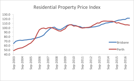
The Australian mining boom started around 2005 and continued into 2015. During this period, there was a large influx of migrants into WA, with the number of full-time employed persons increasing from 718,300 in December 2004 to 976,700 in December 2013. The period from 2013-2016 saw the estimated resident population of WA grow at a rate almost double that of Australia’s (28.4% and 18.4% respectively). A rapid influx of workers resulted in an increased demand for residential property, triggering a Perth housing boom. Perth’s Residential Property Price Index (RPPI) – an indicator of price changes in all residential dwellings – skyrocketed during the mining boom, from 48.3 in September 2003 to 98.4 in December 2006. However once the boom was over around 2014, the RPPI started to track downwards from its December 2014 peak of 114.5 to its present value of 105.5 (chart below).
Source: ABS
As people emigrated, the end result was an oversupply in the property market, which saw a decrease in prices and drastic increase in residential rental vacancies from approximately 2% in January 2012 to 4.6% in August 2017.
Source: SQM Research
Brisbane
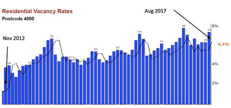
We believe a similar situation has already started to unfold in the Brisbane apartment market. Similar to Perth, the Brisbane economy is heavily influenced by the mining and resources sector. In November 2016 approximately 20% of the Brisbane workforce were employed by the resources sector. Despite the imminent end of the mining boom, there are an estimated 5,200 apartments under construction in Brisbane CBD alone due for completion over the next 5 years, with another 3800 approved for construction. Major developments such as the Queen’s Wharf Precinct are adding 2,000 apartments to the residential market. Vacancy rates in Brisbane CBD have increased from roughly 2% in January 2013 to 6.1% in August 2017. Combined with relatively lower estimated resident population increases when compared to other capital cities such as Sydney and Melbourne over the past few years, all signs indicate that a stagnating demand and increasing supply have resulted in a supply glut in the apartment market.
Source: SQM Research
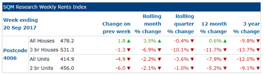
This trend is starting to emerge as some inner Brisbane suburbs such as Fortitude Valley (postcode 4006) have already started to suffer a fall in median unit prices. From July 2016 to June 2017, the median unit sales price for units had decreased roughly 7.78% from $450,000 to $415,000 (Source: RP Data). 64% of this decline had occurred by December 2016, as vacancy rates rose to over 6.5%. Furthermore since 2015, suburbs sharing the 4006 postcode have seen a staggering amount of apartment completions – over 2000 completions excluding the stage 1 completion of a 650 apartment complex and stage 1 completion of a 922 apartment complex. During this period, apartment rental incomes have plummeted as can be seen below.
Source: SQM Research
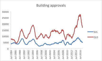
Building approvals for private dwellings excluding houses across Queensland and WA have recently reached all-time highs. In Western Australia, apartment building approvals –which are a lead indicator of construction activity – peaked in June 2015, signalling the end of a construction boom. With Queensland’s peak trailing behind WA – August 2016 – the outcome looks all but disastrous (chart below calculated on a rolling annual basis). Increasing vacancy rates, declining rental income and a large number of approvals and completions are all symptoms of an oversupplied apartment market.
Source: ABS
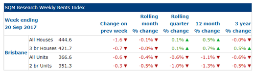
Despite our view that there is an oversupply, property prices can still be driven upwards by two factors – interest rates and rental income. As TAMIM Australian Equity All Cap Value manager Guy Carson mentioned in an earlier article, the RBA are not in a position to decrease interest rates. Australia has the second most indebted consumer in the world with respect to Household debt to GDP. When coupled with record low wage growth, this makes the Australian consumer sensitive to interest rate changes. Since decreasing interest rates isn’t a likely option, it is unlikely that monetary policy will drive prices up further. In addition, a decrease in rental income generally indicates an oversupply of apartments and/or insufficient demand. This extends to property prices and as such, dwindling rental income across the Brisbane region (table below) is likely to further suppress prices.
Source: SQM Research
The question is, how do we obtain value? Our view is to wait for an inevitable correction and investigate areas with strong fundamentals such as large infrastructure spend on education. Queensland Deputy Premier Jackie Trad stated it is “Expected that 3000 extra students will move into inner-Brisbane in the next 5 years”. Capacity constraints in inner-Brisbane state schools such as the West End State School have required an expansion of the school as well as the construction of a new school in South Brisbane. Now, whilst the potential increase in demand is heavily outweighed by the upcoming supply, indicators such as this compel us to further investigate these suburbs and their surrounds.
Ultimately, when investing in property, we want to invest at a price lower than the fundamental value and understand the dynamics of the area we are investing in, especially when identifying triggers that may boost demand e.g. infrastructure spend. As a result, we look towards apartments in inner city Brisbane – an oversupplied area with the potential for stronger, future demand. In our view this correction is inevitable – it’s no longer a matter of if, but when and then we should be ready and willing to buy!
This week the small cap team take a look at the importance of a good management team when investing in a company. They take the time to spell out exactly what they look for when considering management.
Summary:
In our experience management quality is arguably the number one determinant of a company’s long term success. We believe this is more leveraged in a smaller company because each strategic decision can have a larger impact on the future of the business from a relatively lower base. This means getting to know management is an essential part of our investment process. In this article we discuss what we look for in a high quality management team.
Why management are so important in smaller companies?
We believe management quality is the most important single factor to get right when investing in a smaller company for the long term. There are a number of key reasons for this:
Management make the strategic decisions which will determine a company’s long term growth prospects or lack thereof;
Management set the tone for a company’s culture – all employees are guided by management thinking and behaviour;
Employee turnover will be directly impacted by the quality of management – as the saying goes; people don’t leave companies, they leave bosses.
Management are the face of the company in financial markets and investors will ascribe a higher value to high quality management teams and vice versa;
Ethical management teams provide effective risk mitigation against a multitude of risks including fraudulent behaviour, misrepresentation, insider trading, etc.
The list could go on. Suffice to say, picking the right management teams to invest in is an important part of our investment process. Now onto the factors we look for in high quality management teams…
1. Clear communication regarding strategy
In our experience, it is best if management can explain their strategy to investors simply and clearly, and without the use of too many words. This elevator pitch concept is a great way of filtering out complex business models as our best performing stocks have almost always been simple and easy to understand businesses. We believe the simpler the business model to understand, the less moving parts in general, and thus the less unforeseen risks lurking in the background.
Stock example: Joyce Corp (ASX:JYC) management are great example of a clear communicating management team. Whenever we meet management or read through the company’s investor presentations we are 100% clear on where the business is going longer term.
2. A long history of successfully working in the business
We like to invest with management teams who have worked their way through the ranks of an organisation over an extended period of time. These types of managers tend to understand the business better than newcomers who go straight into a top level executive role. And importantly, long term managers will have seen the business through different economic cycles, and thus tend to understand what needs to be done to manage sustainable long term growth.
Stock example: Pioneer Credit’s (ASX:PNC) CEO and founder, Keith John, has been working in the business since the company’s beginnings and in our opinion knows everything there is to know about his business.
3. Shareholder friendly
We are looking for management teams who will put their shareholders first which tends to reflect itself in:
Paying dividends when it is in shareholders’ best interests.
Returning capital when it is in shareholders’ best interests.
Regularly consulting with shareholders for honest feedback.
Factoring shareholder feedback and interests into strategic thinking.
4. A passion for the business
This one seems obvious but it is relatively unusual in our experience. We like to come out of management meetings inspired by management’s energy in the room, and with the feeling that management are having fun in their job. This can only really be gauged through face to face management meetings.
Stock example: (We will need to keep this stock’s name confidential so as not to cause offence.) We recently had a meeting with a management team who were clearly down in the dumps about their business prospects. And importantly, their energy had turned negative after a difficult year whilst their thinking had become defensive. We left the meeting exhausted by the negative energy from the meeting. This is clearly the opposite of what we look for.
5. Humility
We have found ourselves increasingly aware of how humble (or not) management teams are in recent years. In hindsight, this can be explained by our belief that that the least humble, most arrogant management teams have tended to disappoint us over the long term, whilst the most humble management teams have tended to perform the best. There is a great Conversation article on this subject (see website link in references) which confirms our sneaking suspicion that humility in management tends to correlate with long term stock out-performance, and goes on to explain that it is remarkably hard to find humble CEOs these days for the very reason that they have reached the top of the corporate ladder by being highly confident:
“CEOs tend to score higher than the general population on personality attributes such as achievement-orientation, ambition, assertiveness, and risk-preference. Individuals with some, or a combination, of these traits may be particularly adept at pretending to fit ideal criteria for a specific role. For instance, studies show that narcissists are particularly skilled at appearing charismatic at first sight. Charisma, in turn, has long been considered a desirable feature of CEOs. CEOs perceived as charismatic, accordingly, receive higher pay. Genuine humility may thus be a scarce personality feature among candidates for CEO positions.”
- The Conversation, August 2017
6. Skin in the game
In recent years having skin in the game has become a widespread market expectation as the empirical evidence shows that companies run by management with significant stakes in the business significantly out-performs over the long term:
We concur, and aim to invest alongside management teams who are significant shareholders in their business.
Conclusion:
Finding the right management teams to invest in takes a significant portion of our time. In our experience, picking the right company leadership is highly likely to have positive knock on effects throughout the companies being invested in. As a result, we believe time spent looking for the best of the best management teams is time well spent.